Can colour on colour work without being overwhelming? it can if you match your tones.
You’re probably getting the idea by now: I’m all for the use of colour in pretty much any form. And the easiest form at the moment is to choose one background colour and add bursts of other colours to it. This way you can add as much or as little brightness as you want – turning the volume up (as I would), or down, according to your taste.
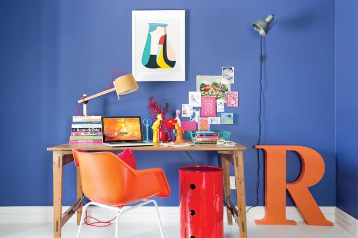
The home office I’ve done up here could have been painted in almost any background colour and the accents would still work. The trick is keeping the intensity of the hues pretty much the same. Here we see teal, dark blue, orange, mustard yellow, red and a shot of pink all in a similar tonality – there are no pastels and no strict primaries.
I always find the whole process of finding inspiration an interesting one – you never know what will start you off. Here I started with the Inaluxe print, as it had some great colours in it – almost all the other colours in the room were influenced by it. The Robin Day Polo chair is the most perfect shade of orange. The Kartell Componibili (used here as extra office storage) is red, but works with the chair because of their similar colour saturation. And you can make the Douglas & Bec Make Your Own Angle Lamp work in any room, as the base, shade and cord can all be chosen and put together in any combination.
So go on – have a go at using colour on colour. Just watch your tones.
For more decorating advice from Anya visit beautifulbedlam.co.nz
Words & Styling Anya Brighouse
Photography Larnie Nicolson