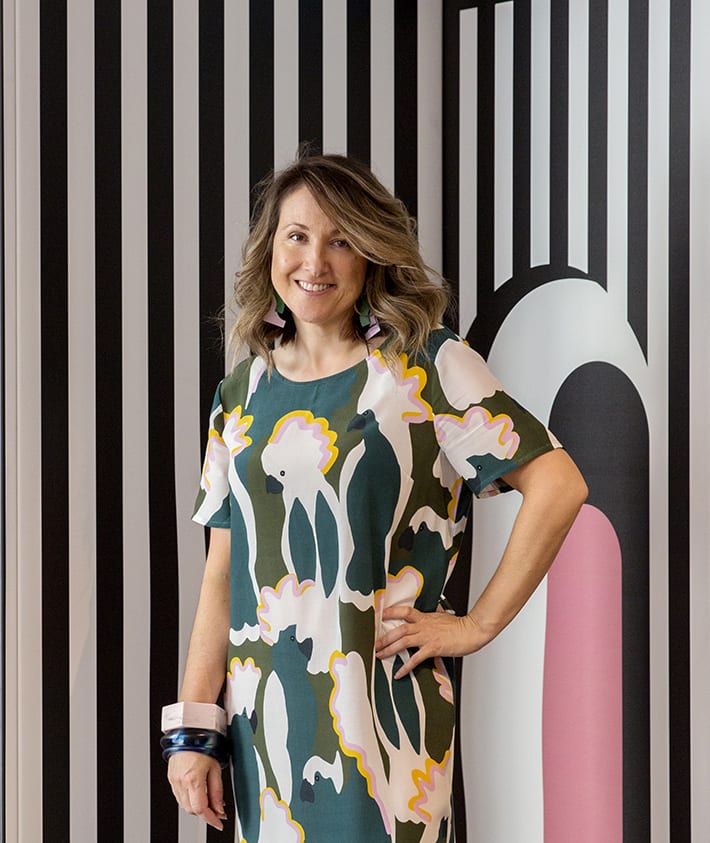
We chat to Bree Leech about her role as creative director of the Dulux Colour Forecast 2019.
Bree, what does your work with Dulux involve? I oversee the Dulux Colour Forecast, helping to provide direction for the trends and overall theme. Collaborating with Andrea Lucena-Orr and Davina Harper from Dulux, we finalise the themes and colour palettes, and I produce the imagery and creative aspects, as well as edit and art direct the magazine.
You look worldwide to identify emerging trends – how do you distill these down into four colour stories? It’s a complex process that takes many months, during which we all contribute ideas and themes before travelling to Italy to attend Milan Design Week. I spend time editing our ideas into what I think are the strongest trends, then while we’re in Milan we either confirm these directions or change them before shaping our final palettes. When we get back, we start to realise these palettes into paint colours and with a few weeks of editing, narrow down what the most important hues will be for the four themes that make up the Dulux Colour Forecast.
Has the rise of social media changed the way colour and interior trends develop? Absolutely. Years ago when I was forecasting trends and colour, we didn’t have the the access we do now to the latest developments in the fashion and design world, so we’d wait for publications to come out or travel to trade fairs — essentially the turnaround of a trend was much slower. Now trends become evident and evolve very quickly.

How do you think colour can improve our wellbeing? People underestimate colour in our home and workspaces; it has the ability to uplift, to calm, to stimulate. Our wellbeing can benefit from relaxing environments created with tonal palettes and we can feel happier when we’re surrounded by colour we love.

Any tips for the budding colour enthusiast as to how they can be braver in their home? Start small – the edge of a door, inside a cupboard. I guarantee that adding these little surprise elements of colour will inspire you to experiment with more. Move onto furniture, and you’ll be painting a whole room in immersive colour in no time.
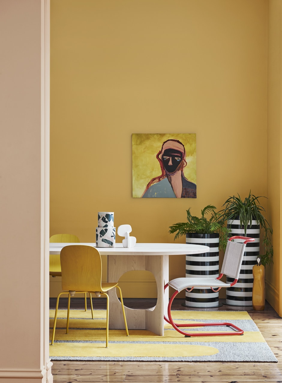
What’s your favourite colour right now? Oh, I can never play favourites! The colour I’m drawn to changes daily – right now I’m loving yellow in a tonal palette that moves through mustard, gold and biscuit with little bits of delicious brown.
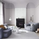
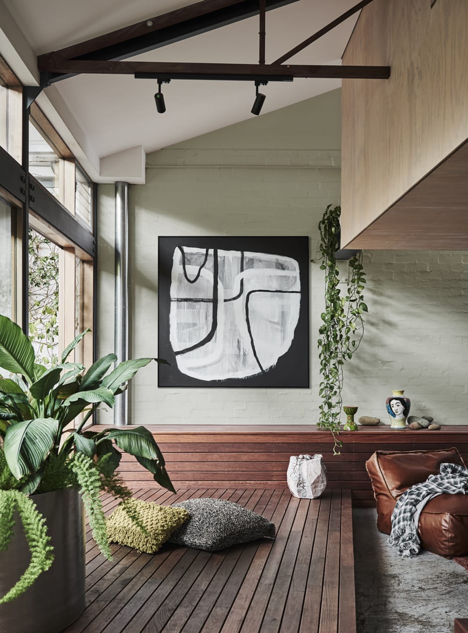
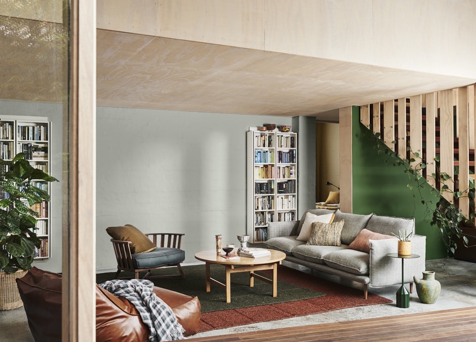
Click here to view the four palettes from the Dulux Colour Forecast 2019.
Styling Bree Leech
Photography Lisa Cohen