Introducing three beautiful new paint palettes that aim to foster connection through colour.
In association with Dulux.
Reset. Retreat. Nourish. The names of the palettes alone are uplifting and soothing. And the paints themselves? Let’s take a look…
The Dulux Colour Forecast 2021 is both a reflection of where we are now and where we’re headed. At its heart is connection — with ourselves, our loved ones, our communities, our environment, our homes. Each of the three hero palettes has been curated with a focus on natural colours and textures that provide familiarity and security while looking to a brighter future.
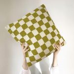
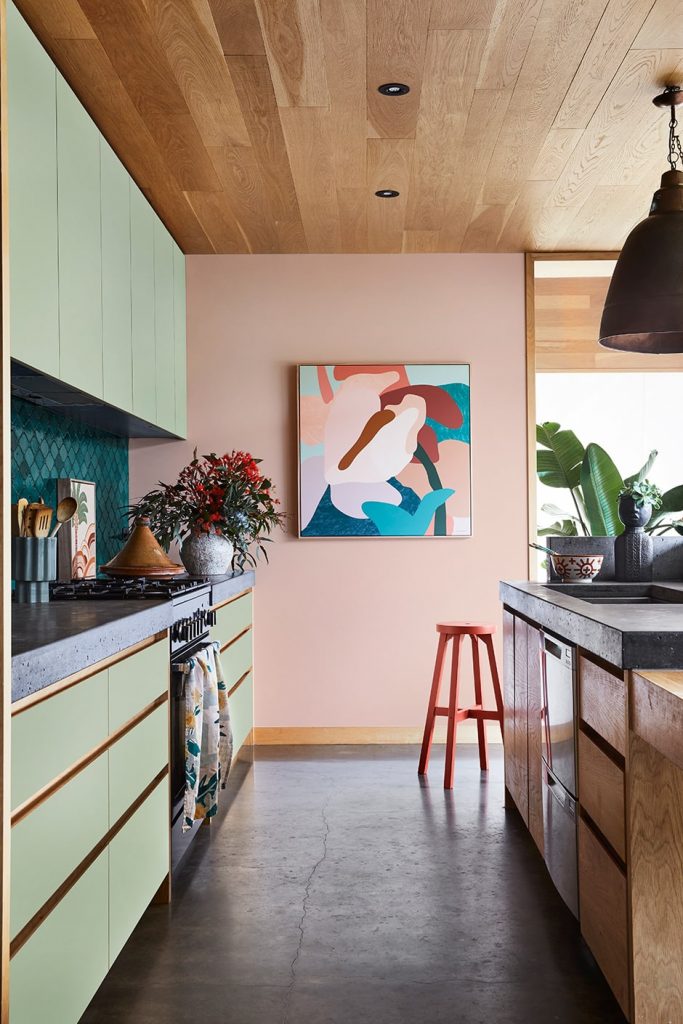
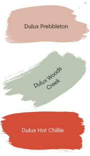
Off-whites to blue-greens to energetic reds, the Reset palette provides gentle encouragement to keep your chin up and remember to have some fun. Renew your outlook with this playful range of shades that includes subtle hints of the ’70s. Enrich your interior with a blend of hues and eye-catching finds, revisit your travels through collected mementos and incorporate some retro-chic to provide a connection to the past as you begin your next chapter.
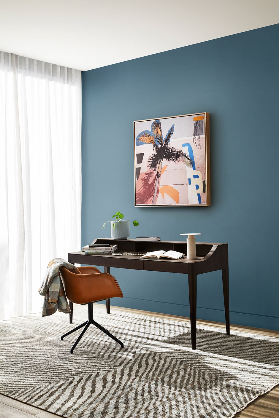
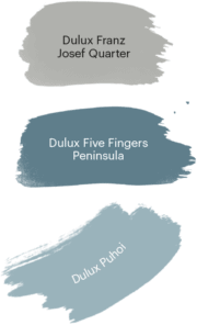
The Retreat palette examines the blurred boundaries of our new normal, in which the concept of home has expanded to become not just a place to recuperate but also to work, work out and do everything else, necessitating more flexible interiors. Embracing traditions such as home cooking is one way in which we’ve sought to find comfort amid uncertainty, and Retreat is born of this sense of nostalgia. Designed to help you create multi-tasking rooms that feel like a refuge, it includes essential whites, greens, greys, browns, blues and burgundy that combine well with authentic textures like timber, linen and wool.
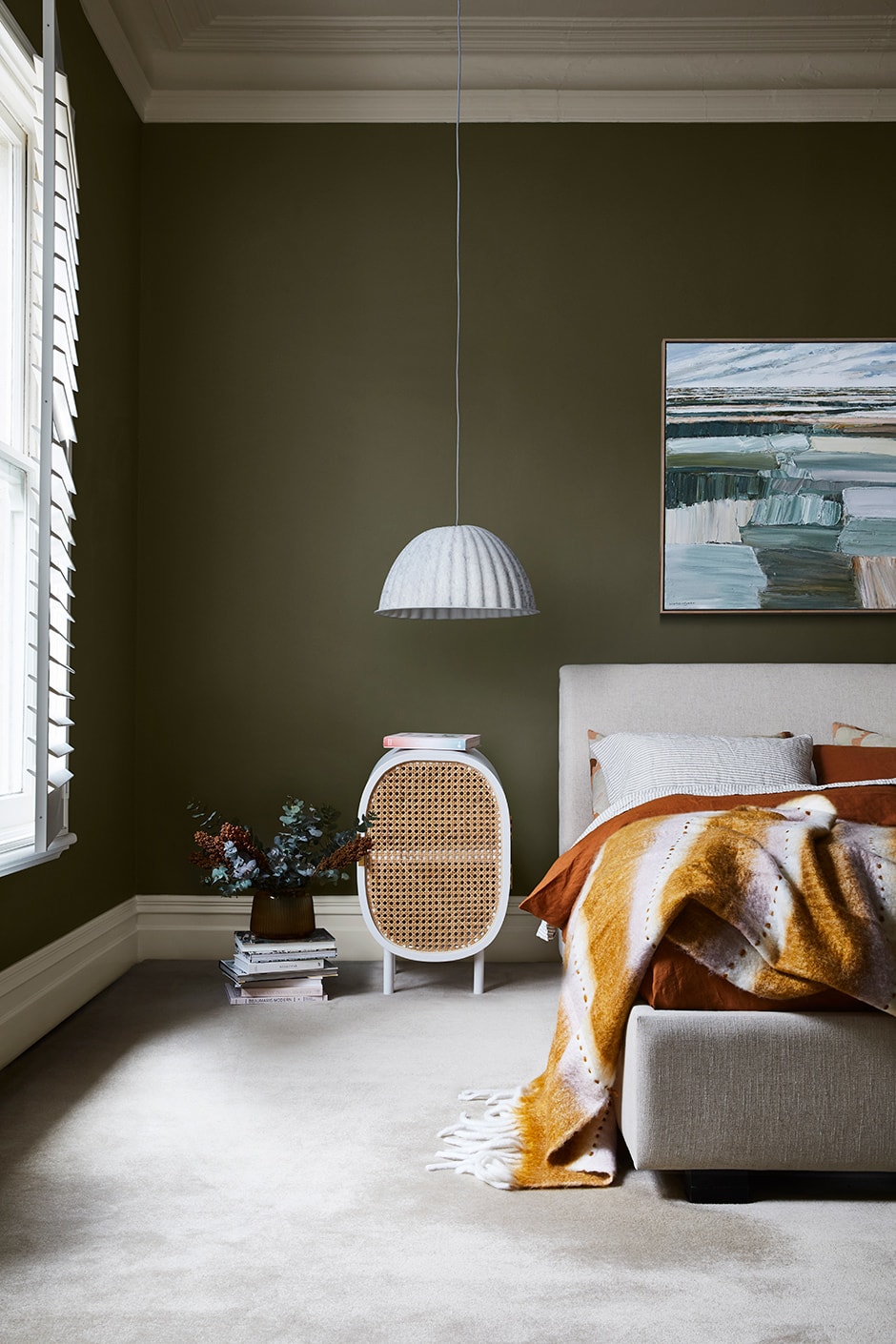
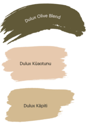
Has 2020 Zoom-ed you into a state of total overload? The antidote as we see it is unplugging often, nurturing our link to nature and prioritising mindful self-care rituals that ground us in the present. A visual interpretation of this, the calming Nourish palette features elemental shades of sandy beige, earthy green, turmeric and tan. They’re naturally beautiful Dulux colours that will inspire you to let the outside in as much as possible, through paint, indoor plants and natural materials — while taking a few deep breaths.
Reset
Retreat
Nourish
Find out more about the Dulux Colour Forecast 2021 and order free large colour swatches at dulux.co.nz/colour
Dulux is a registered trade mark of DuluxGroup (Australia) Pty Ltd. Please note images and swatches may not represent the true colour. Always confirm your final colour choice with Dulux sample pots.
Words Philippa Prentice